Brand Guidelines
This playbook provides a consolidated, central source of information about the Statflo brand, vision, values and identity (visual and voice). It is used to bring the brand to life consistently across all communication touchpoints and channels.
It is a simple, central reference for internal and external stakeholders, including employees, partners, and agencies.
Contents
01 Brand Strategy
02 Personality
03 Logo
04 Color
05 Typography
06 Art Direction
01 Brand Strategy
Our strategy centers on creating a fun, approachable, and confident brand experience that makes people feel supported and inspired. Our tone, visuals, and messaging work together across all channels to reinforce a strong, cohesive identity.
Whether it’s a social post, release notes, or training material, every piece of content should sound and look unmistakably Statflo. This consistency helps us build trust, stand out from competitors, and make our brand instantly recognizable.

We speak like real people, using clear, engaging language that makes complex ideas easy to understand and even easier to get excited about. At the heart of our brand is the frontline. We should make them feel supported, empowered, and ready to win. We celebrate progress, and highlight what’s possible with Statflo by their side.
Visually, our brand is bright, modern, and dynamic. We use playful motion, bold colors, and real people to bring our stories to life. Videos and animations should capture our energy and humor while keeping things simple and relatable. Every piece of content, campaign, and interaction should reinforce the same story.
02 Personality
Approachable & Fun
The telco industry and SaaS world can often feel dry. Statflo changes that by bringing energy and personality. Whether it’s our website, onboarding, training, social posts, or release notes, every touchpoint should feel lively and engaging. Avoid jargon-heavy, corporate-sounding copy. Instead, we use playful, consistent messaging across all channels to build a strong brand identity.
Encouraging & Supportive
Our role is to make frontline reps more confident and successful. Our personality should always feel like a coach on the sidelines: supportive, motivating, and focused on helping our customers win.
Optimistic & Energetic
We should leave our visitors and customers inspired and motivated to use Statflo.
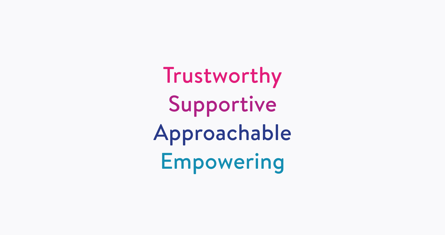
Tone & Voice
Conversational, witty, & approachable
Clear messaging with a fun twist. We are experts in our field, but we don’t take ourselves too seriously.
Upbeat & engaging
We use playful expressions, vibrant visuals, and a lively delivery. Our tone stands out in a space where competitors often sound flat.
Impactful and encouraging
We should leave our visitors and customers inspired and motivated to use Statflo.
Relatable
We should leave our visitors and customers inspired and motivated to use Statflo.
03 Logo
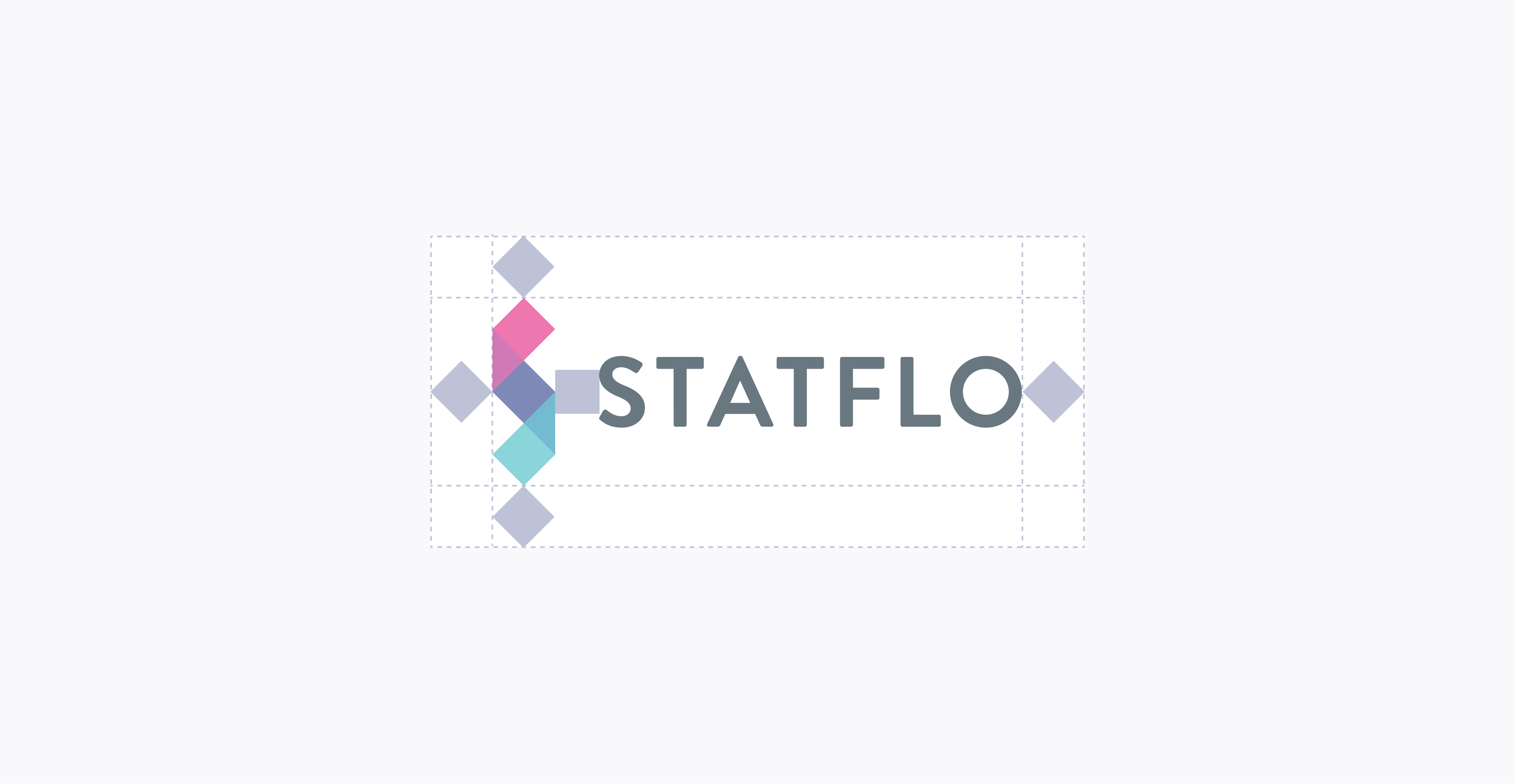
This is the main Statflo logo to be used whenever possible.
The Statflo symbol represents the journey every buyer takes - from cold to warm. Building warm relationships with customers is a constantly unfolding process that takes the right words, timing, compliance and frequent one-to-one interactions.
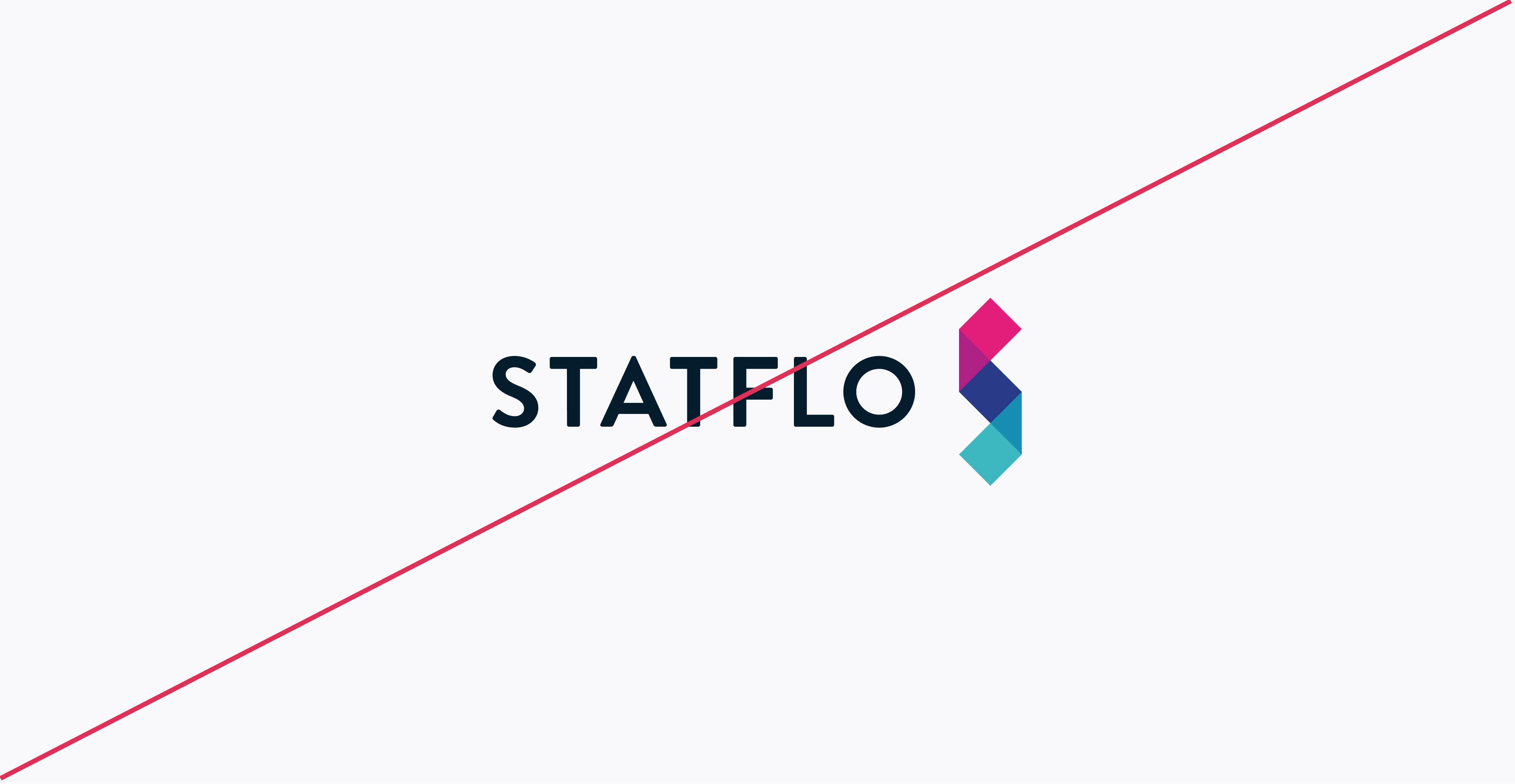
The symbol must always be accompanied by the Statflo work mark unless approved by our marketing team. The logo must always be in color and the warm part of the symbol must always be at the top.
Do not modify the marks, rotate them, or combine them with other logos. Please contact the Marketing Team if you are unsure of how to use it or you require an alternate version.
Primary Logo

Logo Variations


Clearspace
Color Variations


Incorrect Usage

Do not add any gradient to the logo
Do not change the position of the logo

Do not change the font or resize wordmark
Do not squish or stretch the logo
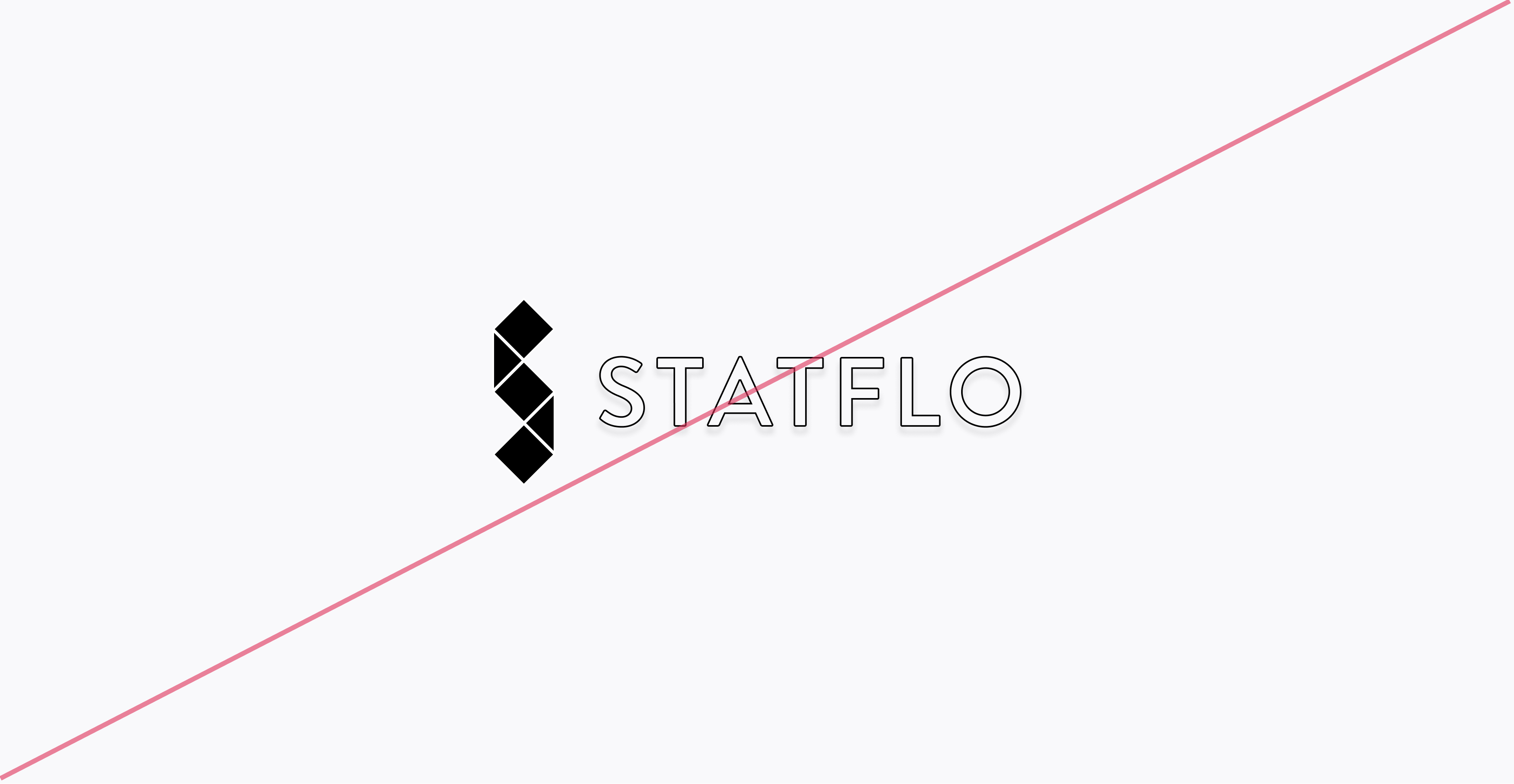
Do not outline or fill the logo

Do not rotate the logo
Partnerships

04 Color
Primary Colors

Magenta
Hex: #E21D7A

Blue
Hex: #293A89

Teal
Hex: #3DB8C0

Ocean Blue
Hex: #158EB2

Blue Tint
Hex: #B6C9CF
Statflo’s primary colors act as key colors in illustrations, icons, and titles. They should follow the mood of what is being said: Positive colors are magenta (or hot), negative colors are teal (or cold). A relationship that is healthy, or a great conversation is warm. A relationship that is unsure, or that needs work, is cold.
You should only use 1 or 2 primary colors at a time, and the dominant primary color should be used impactfully. You should rarely use all 5 at a time (outside of depicting the logo).
Secondary Colors

Button Blue
Hex: #424DE5

Orange Highlight
Hex: #FF7733
Statflo’s secondary colors act as accents, or complimentary colors to our primary colors.
The Blue is typically reserved for buttons.
The Orange is typically reserved for highlights, such as circling a feature in a training document.
Neutral Colors

Dark Grey
Hex: #30374F

Black
Hex: #0D1326

Blue/Grey
Hex: #9EA6C4

Light Grey
Hex: #F9F9FB

Blue/Grey Light
Hex: #BDC2D7

White
Hex: #FFFFFF

Blue Tint
Hex: #CDD2FE

Green Tint
Hex: #D8F1F3

Pink Tint
Hex: #FDF1F7
Statflo’s neutral colors are for backgrounds and text.
If chosing a light shade for a background, a dark shade should be used for the font, and vice versa.
Light shades of our logo colors are typically reserved for putting behind images of our app.
Gradient Palette

Gradient 1
Gradient 2
05 Typography
As with our logo, consistent use of our corporate typefaces reinforces Statflo’s brand identity.

Primary Typeface
Brandon Text

Secondary Typeface
Lato

Brandon Text
This is our primary typeface used everywhere in app, screen, and print.
Turn Every Rep Into Your Top Performer
Brandon Text - Bold: used for all headers
Short brand related phrase
Brandon Text - Medium: used for all sub-headers
Turn Every Rep Into Your Top Performer
Brandon Text - Regular: used for all body copy
Lato
Should only be used as a fallback typeface in cases where Brandon Text is not available.
Turn Every Rep Into Your Top Performer
Lato - Bold: used for all headers
Turn Every Rep Into Your Top Performer
Lato - Medium: used for all sub-headers
Turn Every Rep Into Your Top Performer
Lato - Regular: used for all body copy
06 Imagery
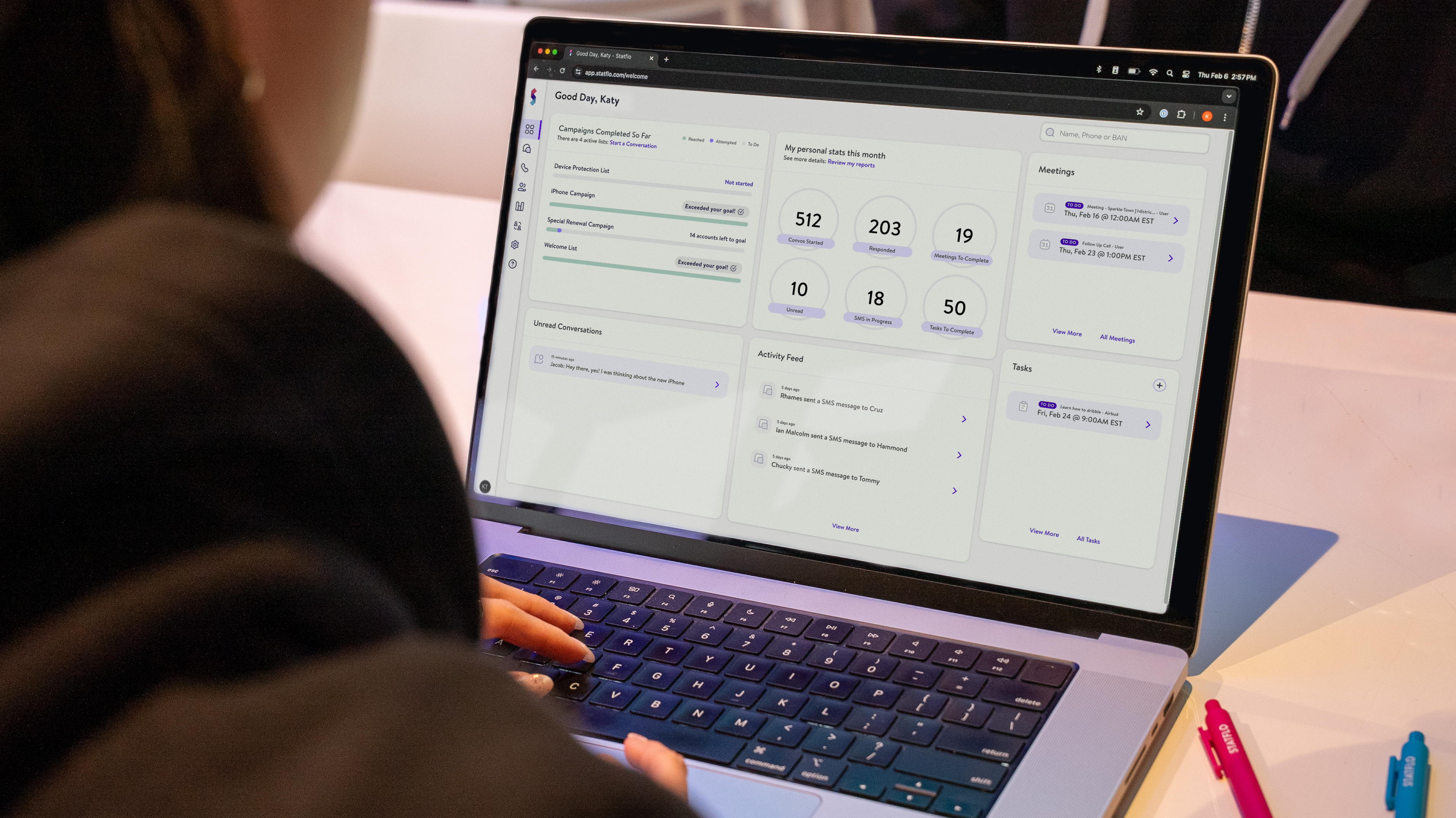
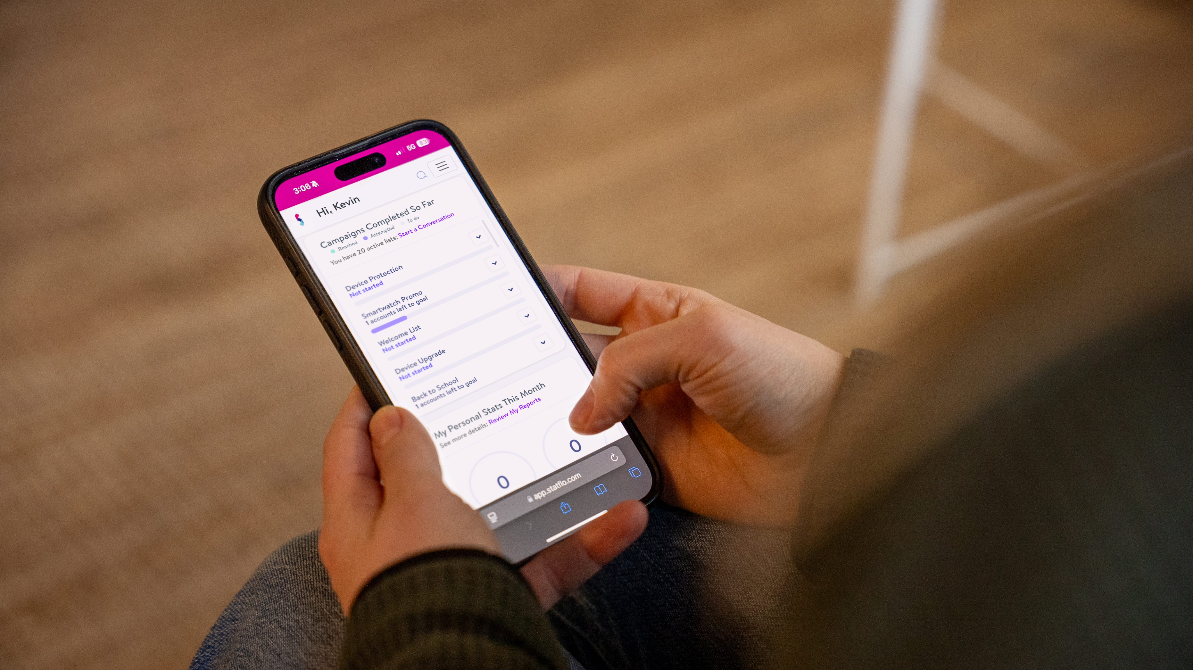
When we are talking about Statflo, we want to show real people interacting with devices (phone, tablet, computer). The intent of the imagery is to illustrate to the viewer that Statflo champions authentic customer conversations for businesses.
Customer Experience


App Images